


CHASE BANK · WEEKLY SPENDING RECAP
A Weekly recap that helps Chase users understand their spending without stress, setup, or judgement
Chase already tracks every transaction. But users were confused, anxious, and avoiding the app entirely. This feature changes that.
Tasks completed
4 of 5
Expressed relief
100%
Found tone supportive
100%
Navigation gap found
1 critical

What?
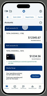
A weekly spending recap feature added to Chase's mobile app to help users understand their finances through passive, plain-language summaries with no setup or budgeting tools required.
For Who?
Designed for everyday Chase users. Especially paycheck-to-paycheck users and ESL users who want clarity and reassurance without complexity.
My Role
UX/UI designer responsible for user research, interviews,persona development, wireframing, prototyping, and usability testing.
What Chase needs
A feature that increases weekly engagement, builds trust in the app, and reduces anxiety-driven support calls without requiring users to set up budgets or configure anything.
What users need
To know if something went wrong. To understand what changed. To avoid surprises. To feel in control without having to dig through data to get there.
FLOW 01 — NORMAL SPENDING
Your spending is right on track
When spending is within usual range, users get a category breakdown, a week-over-week trend, and plain-language reassurance. The recap ends with an optional path to the Spending Planner but it's never required.

FLOW 02 — ABOVE-USUAL SPENDING
Spending spiked.. here is why
When spending is higher than usual, the messaging shifts tone without alarming the user. It names the category, gives context, and offers optional charge review or dispute paths — all calmly.
CHARGE REVIEW AND DISPUTE
Investigate without leaving the recap
Users can drill into any charge, confirm it looks right, or initiate a dispute — all from within the recap flow. Both paths are clear and supportive, with easy return paths back to the summary.

How I did it
RESEARCH
I interviewed five participants across different financial profiles to understand how people track money, what makes them anxious, and what they wish their banking app could do.
Nancy
Paycheck-to-paycheck. Relies on text alerts. Avoids the app when anxious.
"Don't let me get surprised."
Martha
Intentional planner. Tracks weekly. Experiences stress around
big spending moments.
"Help me stay disciplined."
Ryan
Checks Chase 2–3x daily. Googles merchant codes. Frustrated by vague labels.
"Make this smarter."
Nate
Schedule-based. Spreadsheet user. Rarely confused but
dislikes vendor changes.
"Just let me control it."
Sindy
ESL user. Monthly checker. Focused entirely on bill confirmation.
"Just make sure my bills are paid."
Key themes from affinity mapping
54 observations from 5 interviews consolidated into 4 themes. The clarity gap dominated; users were confused by the app and wanted something it didn't give them

Clarity gap
Reactive checking
Anxiety & avoidannce
What feels safe
Clarity gap
Unclear merchant names, buried features, and coded transactions — users couldn't understand what the app was showing them, and wanted plain explanations and spending summaries it didn't provide.
Reactive checking
Users check accounts in response to anxiety, big purchases, or end of month — not proactively. Alerts, spreadsheets, and workarounds fill the gap the app leaves.
Anxiety & avoidance
Low balances, fraud, overspending, and uncertainty trigger stress. Users avoid the app when anxious — waiting until the first week, hoping things are okay rather than checking.
What feels safe
Bills paid, knowing where money went, text alerts — when users have predictability and clear information, they feel confident. This is exactly what the Weekly Recap was designed to deliver.
Path forward
The affinity map revealed that confusion and stress drive avoidance — and that clarity and predictability are what make users feel safe. The Weekly Recap was designed to close that gap.
KEY INSIGHTS
Five patterns that shaped every design decision
1. Confidence ≠ clarity
Even financially literate users experience moments of doubt when transaction information is unclear. Trust breaks when the app can't explain itself.
2. Banking apps are emotional regulation tools
Users check their accounts to reduce anxiety — not to plan. Frequent app use is driven by reassurance-seeking, not financial management.
3. Passive visibility beats active dashboards
Nobody wants to configure categories or set up budgets. Users want the app to understand their finances for them and surface what matters.
4. Language friction exists for everyone
Unclear merchant names and financial jargon create confusion even for native English speakers — it's just normalized. For ESL users, it's a blocker.
5. Stress spikes during exceptions
Overwhelm doesn't happen during routine checks — it happens when something is unclear or unexpected. Design should help users navigate those moments.
LOFI WIREFRAMES
Before adding visual design, I mapped the core flow and alt paths to establish structure and solve navigation early
Before moving to high-fidelity design, I mapped the core flow and alt paths in lo-fi. Navigation was refined early — explicit labeled CTAs replaced icon buttons to make progression through the recap clear and unambiguous.
Flow
Lo-fi wireframe shows the primary recap flow, charge review alt path, and dispute confirmation screens.


USABILITY TESTING
2 participants. 5 tasks. 1 critical fix.
I tested the high-fidelity prototype with two participants using moderated, task-based sessions of 15–20 minutes each. Both participants matched the target persona: users seeking clarity, reassurance, and control over their spending.
Tasks completed
4 of 5
Expressed relief
100%
Found tone supportive
100%
Navigation gap found
1 critical
Task
Enter the weekly recap
Understand weekly spending summary
Review what changed and why
Review and verify a specific charge
Exit the recap and return to accounts
Result
✓ Completed without help
✓ Completed
✓ Completed
✓ Completed
✗ Inconsistent — critical gap
— Nancy
I feel more in control when I see this laid out.
— Danny
I'm usually stressed about money, but this makes sense and feels accurate.
WHAT I CHANGED
Navigation and visual hierarchy


✗ No clear exit from the flow
✗ Text-heavy with no visual summary
✓ "Back to accounts" on every screen
✓ Bar chart replaces text comparison
Insight
Testing revealed two gaps: users felt stuck without a clear exit, and text-heavy screens slowed comprehension.
Adding persistent navigation and replacing text with charts reduced cognitive load and made the summary scannable at a glance.
Above-usual spending flow


Screen 1
Spending flagged on entry. User knows immediately something is different.
Screen 2
Category named, line graph shows the spike in context — not alarming, just clear.
Screen 3
Calm plain-language summary. Names the issue without judgment.