
HOPSPOT
UX / UI Design · Mobile Web · 8 weeks
CASE STUDY
An all-in-one relocation platform that helps people find a home, book trusted services, and connect with their new community.

THE CHALLENGE
Moving to a new city is overwhelming.People jump between multiple apps to search for housing, book movers or cleaners, and figure out what’s happening nearby.This fragmented experience increases stress during an already emotional life transition.

THE OPPORTUNITY
What if there was one place that supported the entire relocation journey — from finding a home to feeling connected?
HopSpot was designed to bring housing, services, and community together into one guided experience.

COMPETITOR LANDSCAPE
Existing platforms focus on single tasks.
HopSpot connects them into one experience.

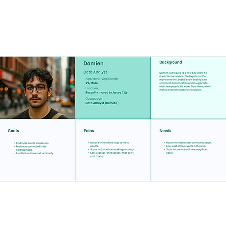
PRIMARY PERSONA
Damien (28) is moving to Brooklyn for work.
He wants to settle in quickly, avoid decision fatigue, and feel connected to his new city.
THE HOPSPOT JOURNEY
HopSpot follows the natural flow of relocation:
-
Find a Home
-
Book Services
-
Join the Community
Each step builds toward feeling settled and confident.

IDEATION & EARLY SKETCHES
I explored multiple layouts and navigation patterns to reduce clicks and cognitive load.
Early sketches helped prioritize clarity before visual polish.

BRANDING & VISUAL DIRECTION
The visual system is warm, friendly, and calming — designed to reduce stress.
Color Logic:
-
Yellow: optimism and guidance
-
Melon: housing
-
Mint: services
-
Blue: community

PROTOTYPE OVERVIEW
I created a high-fidelity, mobile-first prototype in Figma that allows users to search for housing, book services, and explore events.

USABILITY TESTING
I tested the prototype with 5 participants using real tasks like inquiring about listings and booking services.
TASKS
-
Find and inquire about a home
-
Book a service (e.g., cleaning)
-
RSVP to a local event
Tools Used: OBS Studio (recording), Otter.ai (transcription)
Duration: 15–20 minutes per session

WHAT I LEARNED
What worked:
-
Clear concept
-
Friendly visual tone
What needed improvement:
-
Too many clicks
-
Homepage clarity
-
CTA visibility

ITERATION & IMPROVEMENTS
Based on testing, I simplified navigation, reduced steps, improved contrast, and added a clearer primary CTA.
-
3 One-tap buttons in hero section to get started
-
Reduced redundant scrolls and extra screens
-
I added short credibility statements to help users feel confident engaging with the platform.

THANKS FOR CHECKING OUT HOPSPOT
Want to see the prototype or talk through the process?
Let’s connect.


