


HOPSPOT · UX/UI DESIGN · MOBILE WEB
Users understood the concept. What they needed was clearer guidance to act on it.
Relocation forces people to juggle housing platforms, service providers, and community discovery across five or six different tools. HopSpot brings all three into one guided experience — and this case study covers the research, design decisions, and usability testing that shaped it.
Task completion
3 of 3
Homepage or nav friction flagged
3
"Why not just use Zillow?"
1 critical
Issues resolved through iteration
100 %


What?
An end-to-end design of HopSpot, a mobile web platform that consolidates housing search, local service booking, and community discovery into a single guided relocation experience.
For Who?
People relocating to a new city — especially first-time solo movers, remote workers, and anyone managing multiple platforms to complete what is really one continuous journey.
My Role
End-to-end UX/UI designer — user interviews, affinity mapping, competitive analysis, persona development, user flows, wireframing, branding, prototyping, and usability testing.
What HopSpot needed
A single platform that guides users through the relocation journey in order — housing first, services next, community after — reducing the number of tools they need to manage a move.
What users need
To feel supported and confident during a stressful life transition. Not more features — clearer guidance on where to start, what to do next, and why the platform is worth trusting over the tools they already know.
FLOW 01 — FIND A HOME
Browse, filter, and inquire about listings without bouncing between Zillow, Apartments.com, and Craigslist
Users filter by property type, price, and amenities, then view full listing details — photos, neighborhood info, and agent contact — without ever leaving HopSpot. Every listing leads to a single, consistent inquiry flow.

FLOW 02 — BOOK SERVICES
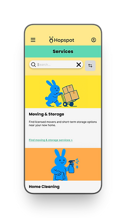
Compare moving, cleaning, and utility providers with transparent pricing and reviews built in
Each service category surfaces provider details, pricing, and reviews up front, so users can compare and book with confidence instead of guessing whether a provider can be trusted.

FLOW 03 — JOIN COMMUNITY
Discover local events and RSVP without having to know what to search for
Rather than requiring users to actively search the way Google Maps does, HopSpot surfaces relevant local events directly — addressing the community disconnection every research participant described.

How I did it
KEY INSIGHTS
Four patterns that shaped every design decision
1. The relocation journey is fragmented by design
No existing platform covers housing, services, and community together. Users stitch the experience together themselves — often across 4–6 different tools. This is the gap HopSpot was built to close.
2. Community connection gets neglected because logistics come first
By the time users finish finding housing and booking services, they're exhausted. Community discovery falls off entirely — not because it isn't valued, but because there's no guided path to it.
3. Trust is built through clarity, not features
Participants wanted reviews, transparent pricing, and clear next steps before taking any action — especially around services. A platform they couldn't read was a platform they wouldn't trust.
4. Users want to be guided, not configured
No participant wanted to set up preferences or manage a dashboard. They wanted the platform to understand their situation and tell them what to do next. A step-by-step experience was more valued than flexibility.
COMPETITIVE ANALYSIS
We studied five apps with similar engagement models to identify what Leeg should adopt, avoid, and build differently
Focus: engagement loops, personalization, habit formation, data visualization. Five apps reviewed across four criteria. The Leeg Implication row is the most important — that's what each app taught us about what to build.
Platform
Strength
Weakness
Hopspot Implication
Zillow
Strong housing inventory, detailed listings, powerful filters. Trusted by all four research participants.
No relocation services. No community features. Journey ends at lease signing.
Zillow sets the housing bar — HopSpot doesn't need to beat it on listings, but must match its clarity and carry the user forward into services and community.
Piece of Cake Moving
Specialized moving services, easy booking, clear pricing.
Narrow scope — moving only. Users still need 3–4 other tools to complete the relocation.
Service booking UX is worth studying — clear provider info and upfront pricing reduce the trust barrier. Replicate this pattern inside HopSpot's service flows.
TaskRabbit
Broad service marketplace, reviews, flexible booking.
Not relocation-specific. No housing, no community, no guided flow for someone in transition.
Review systems and provider profiles are the right model. HopSpot should surface the same trust signals but curate for relocation-specific services only.
Google Maps
Local discovery, events, businesses. Participants already used it to explore new neighborhoods.
Not relocation-focused. Community discovery is passive and unsurfaced — users have to know what to search for.
Community connection shouldn't require active searching. HopSpot's events section should surface relevant local events based on the user's new location — no search required.
Hopspot
The only platform that guides users through the complete relocation journey — housing → services → community — in a single connected experience. Each of the four competitors solves one piece. HopSpot connects them all.
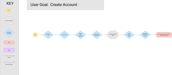
USER FLOWS
Research confirmed a natural sequence — housing first, services next, community last — and HopSpot follows it
Every research participant described the same priority order: find a place, then figure out services, then start to think about community. HopSpot's three-step structure matches this mental model rather than asking users to choose where to start.


BRANDING
The visual system was designed to make relocation feel less overwhelming — warm, optimistic, and easy to navigate
Each color in the system maps to a specific part of the journey: yellow for guidance and optimism throughout, melon for the housing experience, mint for services, and blue for community. A custom blue bunny mascot reinforces the platform's approachable, friendly personality.


Primary
Sunbeam yellow
Use for key highlights, onboarding, and
illustrations to spark optimism and motion.
Clear Sky
Use for headers, icons, and navigation to
suggest openness and clarity
Secondary
Melon Pop
Great for playful buttons or light CTAs
that still attract attention without being
too aggressive.
Minty Fresh
Ideal for status tags, success
messages, or calm touches in
onboarding flows.
Secondary
Soft Cloud
Backgrounds and cards; open and gentle
Stone Gray
Subtle outlines, input borders, and structure.
Ink Slate
Used for body text and contrast-rich headings
LOFI WIREFRAMES
Early sketches focused on reducing clicks and clarifying navigation before any visual design was applied
Lo-fi wireframes explored the three-pathway structure and how to get users from the homepage to content in as few steps as possible.
Flow
— Click on community to go to the “Explore Local Events” page
— Click on event card to see more information
— Click on book to be directed to a confirmation page


HIGH FIDELITY WIREFRAMES
Final screens across all three flows — housing, services, and community — built in Figma and ready for usability testing
Hi-fi wireframes applied the full visual system across every screen in the prototype. Each of the three task flows was fully interactive before testing began.


USABILITY TESTING
2 participants. 5 tasks. 1 critical fix.
I tested the high-fidelity prototype with two participants using moderated, task-based sessions of 15–20 minutes each. Both participants matched the target persona: users seeking clarity, reassurance, and control over their spending.
Task completion
3 of 3
Homepage or nav friction flagged
3
"Why not just use Zillow?"
1 critical
Issues resolved through iteration
100 %
Task
Find and inquire about a home
Book a service (e.g. cleaning or moving)
Find and RSVP to a local event
User 01
✓ Completed
✓ Completed
✓ Completed
User 02
✓ Completed
✓ Completed
✓ Completed
User 03
✓ Completed
✓ Completed
✓ Completed
Charles
Freelance Videographer
What worked
-
Integrated approach — housing, services, and events in one place felt strategic
-
Interface felt intuitive and low-effort to navigate
-
Branding and name appreciated as distinctive
-
Booking flow was logical where functional
What needed improvement
-
Broken links in services section blocked flow completion
-
Redundant clicks to reach destinations
-
Placeholder-heavy prototype limited full evaluation
Damien
Data Analyst
What worked
-
Concept of consolidating relocation needs into one resource felt valuable
-
Color choices — especially green — were visually appealing
-
Some sections felt intuitive and smooth
What needed improvement
-
No back button caused navigation frustration
-
Color contrast issues affected readability
-
Payment and booking flow was unclear
-
Broken ratings and dropdown errors disrupted testing
-
Too many steps to reach key actions
Ryan
Senior Web Developer
What worked
-
Downstream pages (services, events, listings) were detailed and well-structured
-
Recognized revenue potential and competitive opportunity
What needed improvement
-
Homepage cluttered and failed to communicate why to use HopSpot over Zillow
-
Buttons didn't appear interactive
-
Navigation layout on homepage was not intuitive
-
Platform needed data-backed messaging to build credibility
WHAT I CHANGED
Three changes made after testing revealed users couldn't act on a concept they believed in.
Every participant validated HopSpot's value. What stopped them was unclear messaging, navigation friction, and visual signals that didn't build trust. These three iterations addressed each blocker directly.
ITERATION 01 — HOMEPAGE & VISUAL CLARITY
I replaced the generic CTA with three direct entry points and improved contrast after users couldn't tell why HopSpot was different or what was interactive


✗ Generic "Learn More" CTA — no clarity on what HopSpot does
✗ Value proposition buried below the fold
✗ Low contrast and buttons that didn't read as interactive
✓ "Three one-tap entry points replace the generic CTA: Find a Home, Book Services, Join Community
✓ Credibility statements added to establish trust before asking for action
✓ Contrast and button affordances improved across the page
Insight
User 01's question — "Why should I use this instead of Zillow?" — was the clearest signal in all three sessions. The homepage needed to answer that question in the first scroll, not after the user had already moved past it.
ITERATION 02 — NAVIGATION
I removed redundant steps and resolved broken links after all three participants encountered navigation friction


✗ Multiple clicks required to reach housing or service content
✗ Broken links in services section ended flows prematurely
✗ No back button on key screens
✓ Intermediary screens removed — more direct paths to content
✓ Broken links resolved across all three task flows
Insight
Navigation friction in a relocation context carries emotional weight beyond inconvenience. Every extra click during a stressful life transition reinforces the feeling that the tool is making a hard thing harder.