top of page

VAYNERMEDIA ·  SENIOR CONTENT CREATOR

Modular Design Systems 

Reusable layout patterns designed to scale across brands, formats, and content needs.

Brand systems built

2

Reusable layout patterns

3

Organic followers

(Ortho series)

1,200+
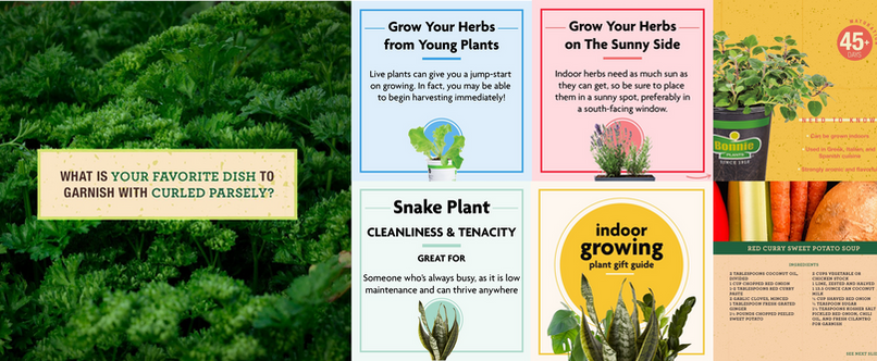
image.png

OVERVIEW

I designed modular content systems instead of one-off posts

At VaynerMedia, I designed modular visual systems for Miracle Gro and Bonnie Plants that supported a wide range of social content — educational posts, seasonal recipes, and engagement prompts — while maintaining strong brand consistency. Rather than designing each post individually, I built repeatable layout patterns that could absorb new content without losing visual structure.

THE SYSTEM

Three layout patterns carried every piece of content across both brands

PATTERN 01 — EDUCATIONAL CONTENT

We built one layout structure and reused it across every plant type without breaking brand consistency

Each post followed the same structure: large product or plant photography anchored to one side, a bold crop name as the primary headline, and icon-led instructional blocks for care requirements. Content swapped — chives, oregano, peppermint — but the structure never did, which let production move faster without sacrificing brand cohesion.
 

image.png

PATTERN 02 — RECIPE CONTENT

We used a consistent carousel rhythm so seasonal content could scale without a redesign each time

Recipe posts followed a strong title band, supporting imagery, and a multi-slide carousel structure with clear separation between ingredients and directions. This allowed new seasonal recipes to be dropped into the system at any time without requiring new layout decisions.

image.png

PATTERN 03 — ENGAGEMENT PROMPTS

I improved contrast and button affordances after User couldn't tell what was interactive or what happened after booking

Engagement content used full-bleed photography with a centered, framed headline and high-contrast typography for legibility. Minimal copy was intentional — the format was built to drive comments, not reading time.

image.png
Why this scaled

Fixed structure, swappable inputs

The same layout was reused across plant types simply by swapping the content inputs — the crop name, the photography, the instructional copy. Structure stayed fixed. This is what made the system scalable: production speed increased without a corresponding drop in visual consistency.

SUPPORTING CONTEXT

The same systems-first approach carried across other brands at VaynerMedia

ORTHO

Bug Bruh Series

The Bug Bruh series applied the same content-system thinking to a different brand and audience — bachelor renters dealing with pest control for the first time. The series grew Ortho's TikTok following organically while maintaining strong average paid views, proving the modular approach could adapt tone and audience without rebuilding the system from scratch.

Organic follower growth

+1,200

Average paid views

60K–90K

Path forward

The affinity map revealed that confusion and stress drive avoidance — and that clarity and predictability are what make users feel safe. The Weekly Recap was designed to close that gap.

CASPER

Sleep Professor Series

An educational series covering sleep hygiene, sleep myths and studies, and reactionary content. The series used the same modular thinking as the plant brand work — a fixed format that let new topics rotate in weekly without a new creative direction each time.

Path forward

The affinity map revealed that confusion and stress drive avoidance — and that clarity and predictability are what make users feel safe. The Weekly Recap was designed to close that gap.

MIRACLE GRO

Video Content

Miracle Gro's video content mixed seasonal product promotion with humorous, relatable plant-lover content — built for anyone with a green thumb to laugh at or recognize themselves in. The same modular thinking applied here: a consistent format and tone that could flex between promotional pushes and lighter, personality-driven moments without breaking brand voice.

Path forward

The affinity map revealed that confusion and stress drive avoidance — and that clarity and predictability are what make users feel safe. The Weekly Recap was designed to close that gap.

BONNIE PLANTS

Video Content

Bonnie Plants' video content focused on quick, educational fun facts about growing herbs and vegetables, paired with seasonal promotional content. The format stayed short and informational by design — built for viewers to learn something useful in a few seconds while reinforcing Bonnie as an approachable, knowledgeable brand for home growers.

Path forward

The affinity map revealed that confusion and stress drive avoidance — and that clarity and predictability are what make users feel safe. The Weekly Recap was designed to close that gap.

REFLECTION

"The skill wasn't designing one good post — it was designing a structure good enough to support hundreds of them"

This work reframed how I think about content as a designer — not as individual assets, but as systems with fixed structure and swappable inputs. Every brand I worked with had a different voice, audience, and goal, but the underlying design problem was the same: build something repeatable enough that quality didn't depend on starting from zero each time.

Working across Miracle Gro, Bonnie Plants, Casper, and Ortho also taught me how to translate one system into completely different contexts — a gardening brand and a pest control brand have nothing in common on the surface, but the same modular thinking applied to both. That's the part of this work that connects most directly to product design: the goal was never the individual post, it was the system underneath it.

"Once the structure was right, the content almost designed itself."

If I were to take this further

I'd build out a documented component library for each brand's content system — similar to a design system style guide — so the patterns could be handed off and used consistently by other creators, not just held in my head.

bottom of page